Essential Guide to UI Design Principles

Visual design is an essential aspect of creating successful products and services. It is the art of arranging design elements in a way that is both aesthetically pleasing and functional. In this article, I quickly cover some of the essential principles of user interface design that every designer should know. Topics include color and contrast, alignment, proximity and repetition, balance and scale, negative space, and visual hierarchy. By the end of this article, you will have a better understanding of how to create visually appealing and user-friendly designs that communicate effectively with your audience.
Hierarchy

Visual hierarchy helps designers organize and prioritize content in a way that makes it easy for viewers to understand. By combining design elements such as size, color, contrast, typography, spacing, and composition you can create a visual flow that guides the viewer’s eye through the content. This helps ensure that the most important information is presented first and that secondary content is presented in a way that is easy to understand.
To create an effective visual hierarchy, think about what information is most important to your viewers and then use tools such as size, color, contrast, and negative space to structure your content.
Typography

Headings are an important part of any design. Choose fonts that are easy to read on screen. It’s a good idea to start with three levels in your typographic hierarchy and add others as you need them. Choose typeface categories and styles carefully and make sure that your text is large enough; 14px is a good starting point for body copy.
Balance & Scale
Balance is how elements such as shapes, colors, and text are distributed to create a sense of equilibrium and coherence. It helps ensure that no single element dominates the design, but rather, there is an overall visual equilibrium. In UI design we’re most focused on symmetry.
Scale is responsible for creating a visual hierarchy among elements of your design. It tells viewers which elements to look at, in what order to look at them, and what’s most important to focus on.

Negative Space

Negative space, also known as white space, is the empty area around, between, and inside design elements. It helps create balance, contrast, and visual hierarchy in a design. Negative space can be any color, texture, or pattern, and it can be used to guide the viewer’s eye through the content. In UI design, negative space is a big factor in high usability and navigability of the interface.
Proximity & Repetition

Proximity refers to the placement of elements close to one another to create a visual relationship between them. It helps organize information and create a sense of hierarchy in the design. Proximity can be used to group related elements together and separate unrelated elements.
Repetition involves repeating visual elements such as color, shape, or typography to create a sense of unity and consistency in the design. Repetition can be used to create patterns, and establish a visual rhythm.
Alignment

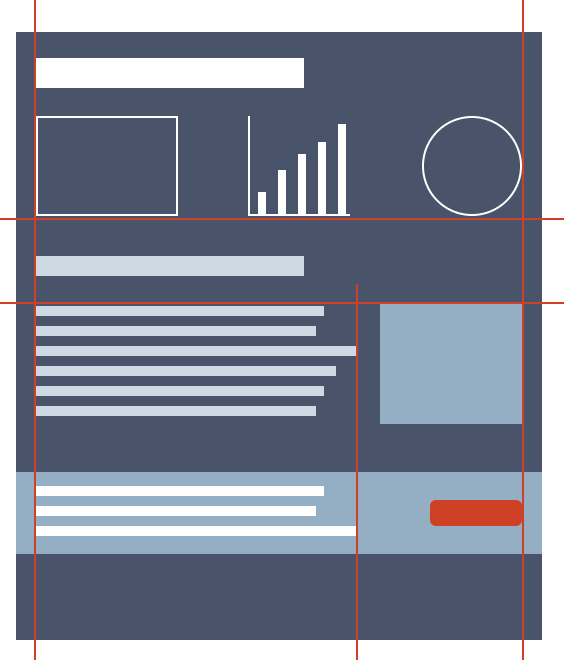
Alignment is a way for designers to create a sense of order, balance, and visual appeal. It involves positioning elements relative to one another or a common baseline to achieve a structured, cohesive, and easily navigable interface. UI designers may use a column or grid system to help with alignment; this is particularly helpful when designing responsive interfaces.
Color & Contrast

Color and contrast are two critical components to a successful UI design. Color can be used to create a visual hierarchy, establish brand identity, and evoke emotions. However, it is important to use color with caution, as too many colors or poor color choices can lead to visual clutter and confusion.
Contrast refers to the difference between two elements in a design, such as between text and background. High contrast can improve readability and accessibility, while low contrast can make it difficult for users to distinguish between different elements. When choosing colors you should always check to make sure that your colors meet WCAG accessibility guidelines using the WebAIM color contrast checker or a similar tool.
Consistency

Consistency refers to maintaining uniformity in various elements across a digital platform. This uniformity includes colors, fonts, icons, navigation, and even terminology. The consistency design principle states that a user interface should be consistent in its language, look and feel, and behavior.
This means that the user should be able to use the same language, terminology, and interactions throughout the product, without having to learn new things every time they encounter a new screen or feature. Consistent designs can reduce cognitive load, increase efficiency, build trust, and support scalability.
Summary
In this article, I briefly explored the essential elements of a successful user interlace design, focusing on key elements such as color, typography, and layout. By mastering these foundational elements, designers can elevate their work and effectively communicate their message to the audience.
Download a PDF version of this design guide for offline use.
This article is licensed under CC BY-NC-SA 4.0


