What can we do for you?
Need help with a project? Book a call today and let's chat!

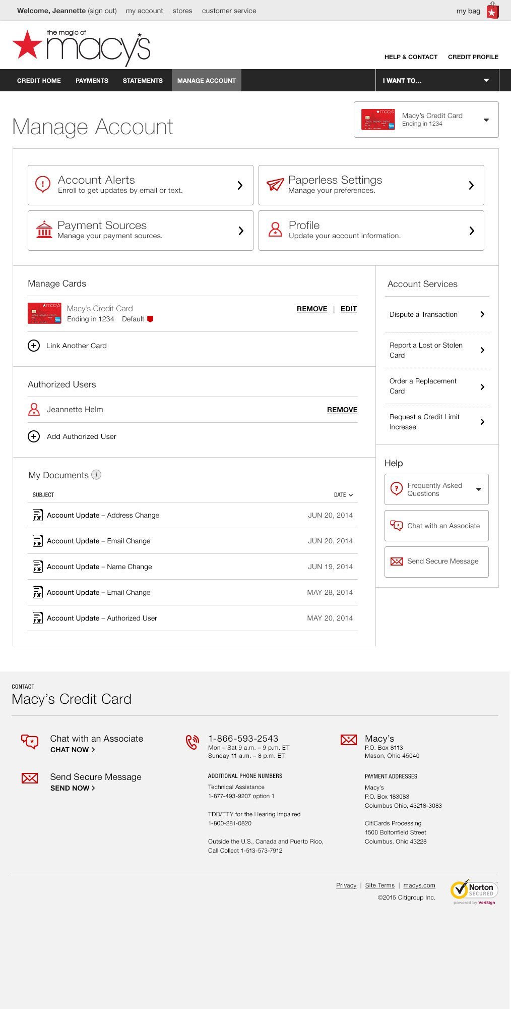
For this project I led a large, cross-functional team on a multi-year series of projects for Citibank. My team was responsible for wireframing and interaction design, high-fidelity comps, functional requirements, and content strategy and copywriting. We were also responsible for ensuring brand alignment with more than 20 of Citi’s partners, including The Home Depot, Best Buy, Macy’s, Bloomingdale’s, Sears, Shell, ExxonMobil, and American Airlines.
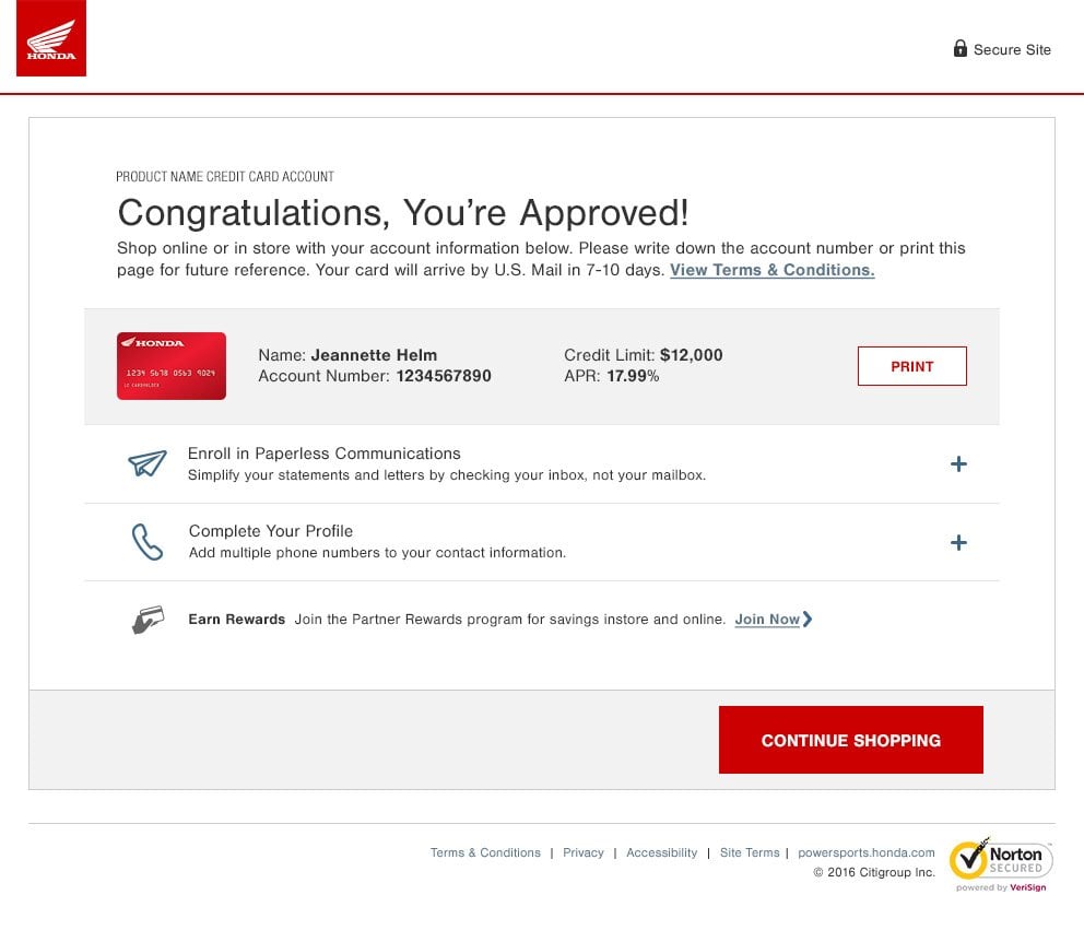
The enhanced usability and contemporary design helped Citi sell its credit card servicing and application offerings to new customers, adding American Honda, Bombardier, Monro, and others.
CLIENT: Razorfish/Citibank
ROLE: UX Design, UX Direction
My team was cross-functional and consisted of UX designers, UI desigenrs, art directors, content stategists, copywriters, and business analysts. For the first few years, Razorfish development teams coded the front end, and code packages were passed to Citi for integration and user acceptance testing (UAT). In later years Citi assumed control for all development.
Our documentation consisted mainly of annotated wireframes and detailed copy decks in English, Spanish, and French. The complete documentation set ran more than 1,400 pages.
These credit limit increase wireframes represent our typical wireframe deliverables.
The updated balance consolidation (balcon) module presented some new challenges. The balcon process was variable depending on whether the customer had available offers and what types of offers were open to them. The system relied heavily on contextual content, the first problem was already solved. However, the balcon flow itself could vary from offer to offer, and the pages pulled content from four different systems. We built several prototypes to validate the flow and to ensure that it worked in a variety of situations. The team's business analyst was key to helping us understand the requirements and ensuring that we met them.
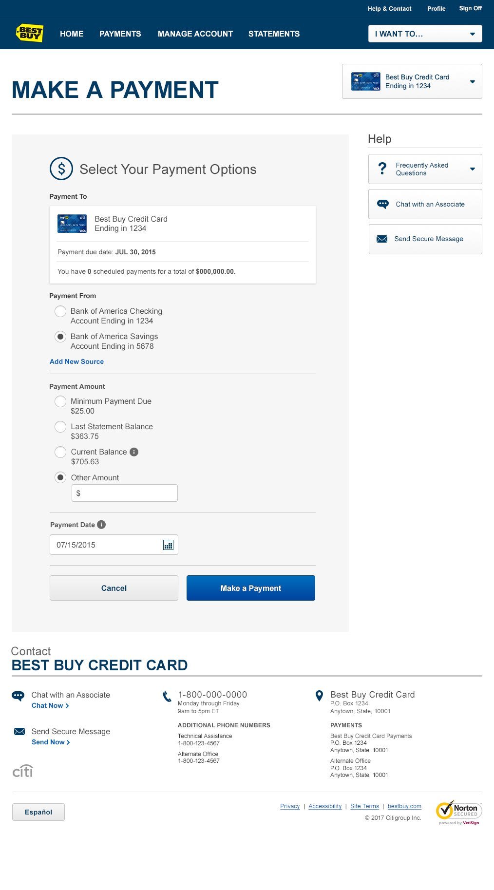
Promotional payments are a great way credit card customers to pay off a large purchase over time with low or no interest (for example: you buy a new fridge with an 18-months-no-interest offer). However, many customers don't pay them off on time and end up getting hit with exorbitant interest charges later. Citi wanted to offer customers the option of making payments directly against a promotional balance, which would help customers avoid this problem.
It's fair to say that this was easier said than done. There are significant regulatory restrictions on how credit card payments can be applied, and while Citi had gained regulator approval for this project, we still had hurdles to clear. There were disagreements with the client in terms of how to accomoplish this, and we ended up conduting a usability test to validate our proposed approach. (Please contact me if you're interested in learning more about that testing.)
Once Citi approved our approach, we went to work to design as simple a solution as we could. This was an update to the existing payments page, and like much of our other content, this behaved contextually depending on the customer's account status. We had to account for multiple promotational payment plans; almost all customers had three or fewer, so our design accomodates up to three.
Explaining how the process worked was a real challenge, but our copywriters did an amazing job. After a few rounds of back-and-forth with legal we were all set!
While the team did most of its work in wireframes, we did produce hi-fidelity comps as well. Below are some branded examples of that work to show how the final product looks in the real world.
During my tenure I also assumed leadership of the team responsible for the acquisitions (credit card applications) component. The team had been left with some leadership gaps and needed a lot of help. But with time and patience I was able to bring the teams together, improve morale, and unify our workflows.


Need help with a project? Book a call today and let's chat!